Creating Email Templates
We provide 3 free methods to create an email template. One option is to use pre-designed templates crafted by our designers. You can also import your own templates and alternatively, if you prefer to design your own from scratch, you can use our drag-and-drop editor. Follow this step-by-step guide to create a professional template on your own.
SMS
Email
WhatsApp
Social Media Management Panel
Creating Email Templates
Creating email templates allows you to save time and ensure consistency across your email campaigns. Templates provide a predefined structure and design that can be reused, making it easy to maintain your brand’s look and feel in all your communications.
Email Template WYSIWYG Editor ( Video Illustration)
This short video illustrates how to navigate in the email template editor, using various widgets through drag and drop and how to locate various widgets and their settings (customizations)
Step-by-Step Guide (With Screenshots) to Creating Email Templates
Step 1: Access the Templates Section
– Log in to your email platform.
– Navigate to the “Templates” section from the main dashboard.
Step 2: Start a New Template
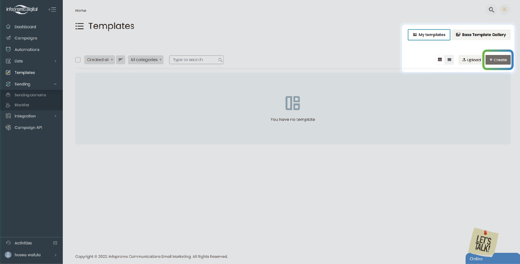
– Look for an option to “+ Create”
– Click on this option to begin creating your template.
You can create “Upload” to upload your custom template (although this is not recommended as most templates don’t conform and cant be edited by our editor)
—
Step 3: Choose a Template Format
– Create a name for your template and proceed to select any of the templates in the section below.
– Select a format for your template. Most platforms offer various options such as:
– Blank Template: Start from scratch with a blank canvas.
– Base Templates-These give you the option to customize and add your contents
– Pre-designed Template: Choose from a library of pre-designed templates that can be customized.
In this example, we are going to select a ‘Column template‘ design
– Proceed and click “Start Design” to proceed to the drag-and-drop editor.

—
Step 4: Design the Template Layout
– In the editor view, there are various panels.
A) Top – You can save, change templates, clear, edit & upload templates under the “Design” button. You can preview in desktop and mobile mode and also view the source code or design view.
On the extreme top right, you can preview the template in the desktop, tablet, and phone mode and also “Save“; to save and continue editing and “Save & Close“; to save and exit.
B) In the middle panel, you can customize the contents of your template
C) In the right panel, you can drag and drop various widgets, use tags, and also do custom settings of various widgets dragged and dropped.

—
Step 5: Customize the Template
The Block Element
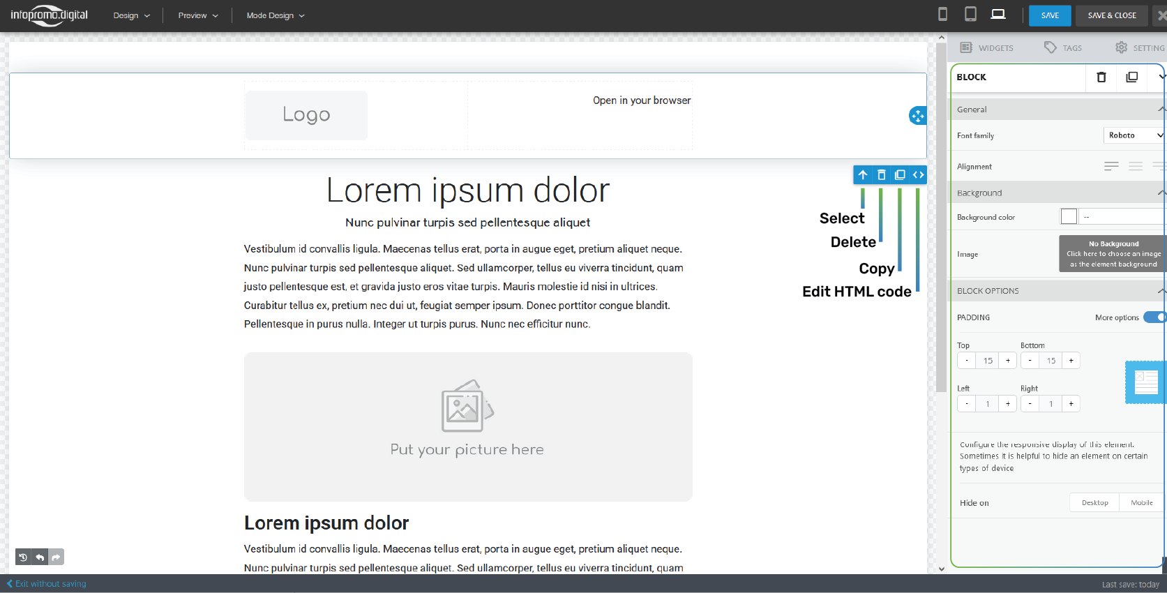
– Upon mouse hovering, you will observe a dotted line in most sections and elements. To know the blocks sections, upon mouse hovering they will be named ‘Block‘.
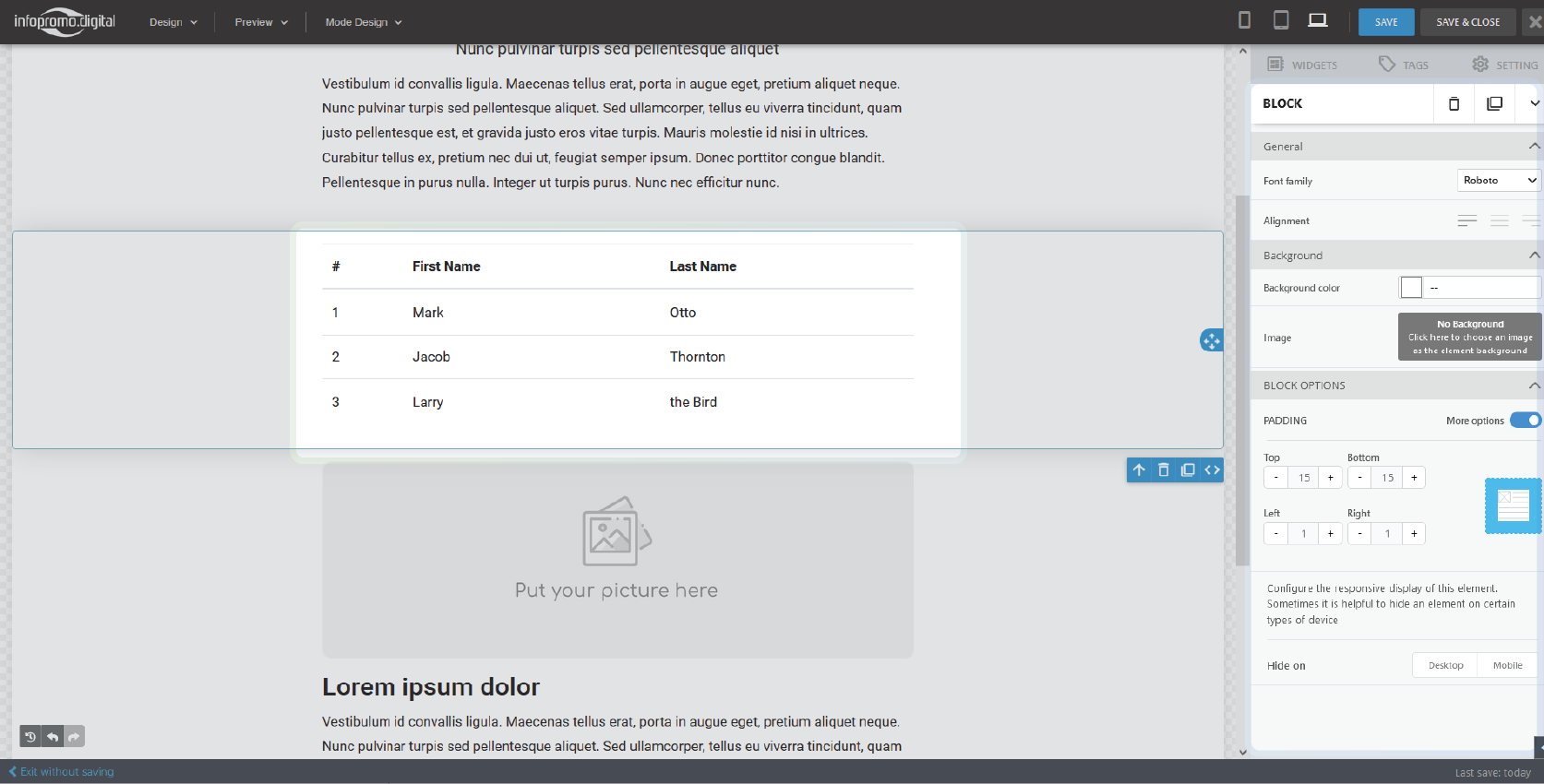
– On click, a panel will be shown on the right with a bold heading BLOCK where you will have options to change its font family and alignment, background color and image, set padding options, and configure responsive displays.
—
The Widgets Element
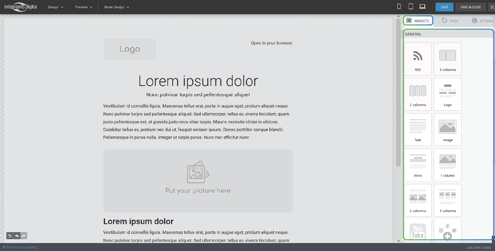
– Widgets are elements that compose or make up parts of your email content. There are various widgets that help you add images, text, columns (layout), and social handles. Access various widgets on the right side of your screen and drag and drop them on the particular layout you are working with.
– After drag and drop, proceed to select any of them and then proceed to the right to customize them depending on the specific widget.
—
The Column Element
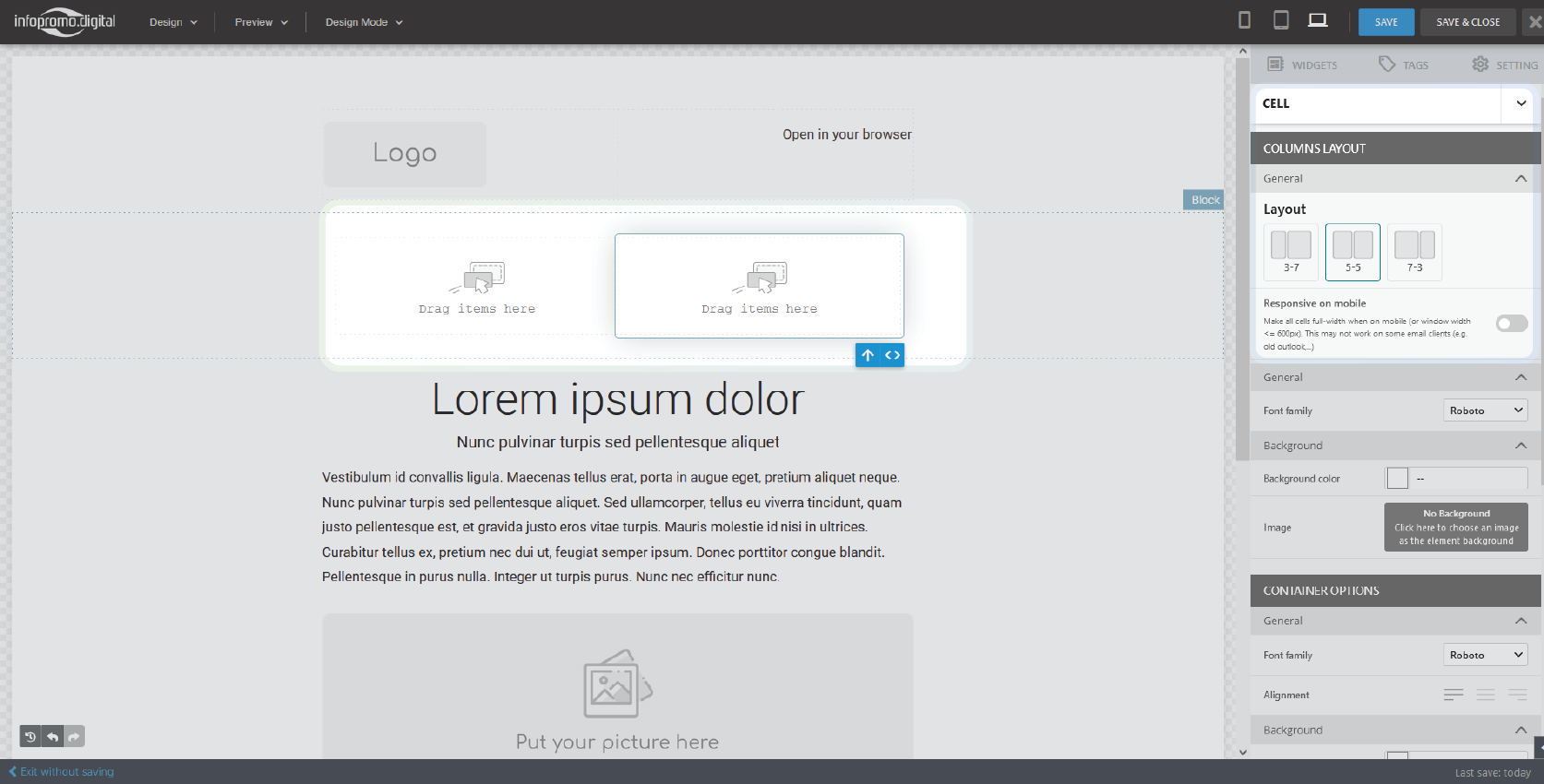
Columns are the building blocks of your email template. They enable you to combine different elements to form your layout. There are 2 columns and 3 columns widget in the widget section
– Drag and drop either of the widgets according to your use cases and proceed with customizing it.
– Select any cell and on the right panel, proceed and customize the layout structure and other settings.
– Proceed to add different elements from the widgets in the spaces labeled “Drag items here” and proceed to customize them.
—
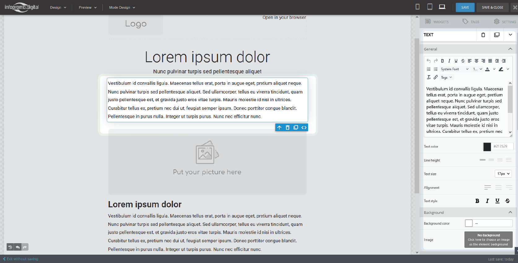
The Text Element
– Adding texts can be done in various ways. Using the widgets, you can drag and drop various widgets that will give you texts in various forms ie. paragraphs, headings, subheadings, intros, boxed texts, page headers, articles, etc.
– After dragging and dropping text, proceed to the right pane to customize their appearance such as the text contents, line height, alignment, text size, color, background, margin, responsive display settings, etc. You can also customize the appearance of the text content container.
When you select a template to customize, by default you will find lorem ipsum texts in the text placeholder so click on the text and customize your text content on the right plane.
—
The Picture Element
– Drag and drop an image widget to your layout and proceed to customize its appearance.
– You can change the image by clicking on the “Change Image” button and an interface will appear for you to drag and drop an image there or upload it from your computer and it will appear in the template.
– Alternatively, you can include the image URL, or proceed to the file manager where you will select it if you had uploaded it recently to reuse it.
– Proceed to give the image an alternative text and change the width and height values using the slider or click on fixed to maintain an aspect ratio.
– Set the alignment, image size, image link, padding, and responsive settings.
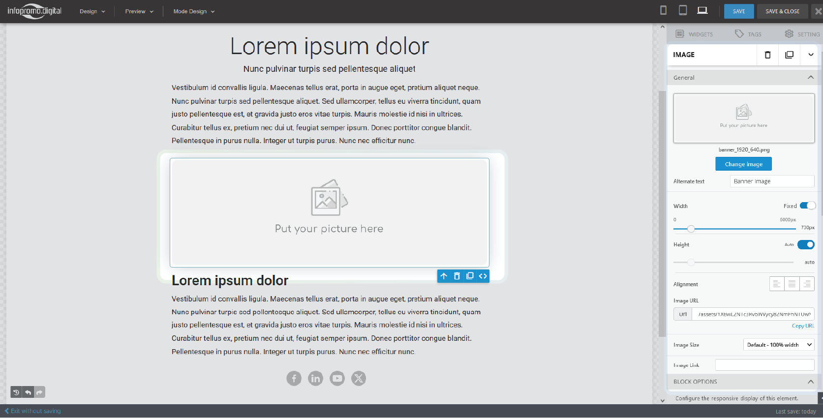
After clicking on the change image button.

—
Picture editing
You can change the parameters of each picture in the panel on the right.
Alternative Text
Sometimes, email apps don’t display pictures within incoming emails. If there is no alternative text for an image, the recipient will see the file name, which can confuse the reader and trigger spam filters. Therefore, we strongly recommend using the alternative text option in your templates.
Image Width
Each image added to the template is displayed at 100% size. You can reduce it to 10%, but remember that on mobile devices, all images are displayed at 100% size. Keep in mind that changing the image’s width will also change its height. Thus, it is better to resize the image before inserting it into the template editor.
Alignment
Alignment refers to the picture’s position relative to the edges of the element you add it to. You can align the picture to the left, right, or center.
Inner Padding
The value of this parameter is the even indentation of the image from the edges of the element: top, bottom, right, and left.
Background Color
This parameter sets the background color for the element containing the picture.
Contour
With this option, you can add a border around your image or image element. Check the Contour checkbox, and then specify the frame’s color, type, and width.
Link
Use this option to add a hyperlink, phone number, or email address link to the image. If you link a phone number, the recipient will click on the image, and their default telephone app will start to make a call to the linked phone number. If you link an email address, don’t forget to add an email subject — when the recipient clicks on such an image, their default email application will open. Note that you need to provide a full link to the page, starting with https://.
The Button Element
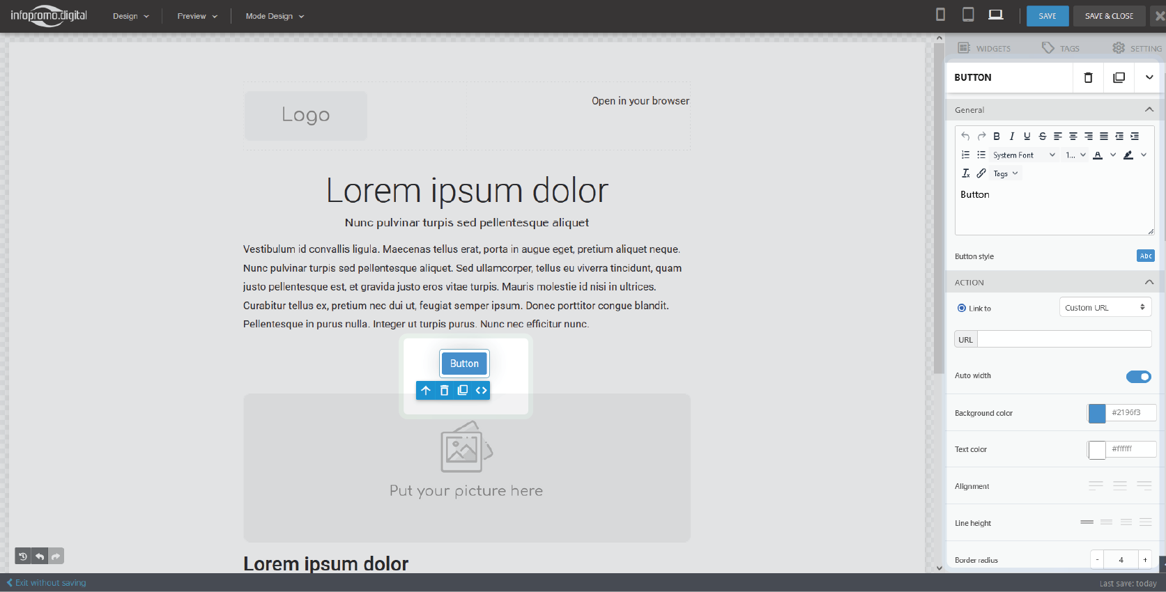
– For you to add a button, drag and drop either the ‘button‘ or ‘button 2‘ widget to your template.
– Click on your dropped button and on the right you will have options to change the button name, set a custom URL, change text and background color, alignment, line height and border, and padding radius among other parameters.
—
The Video Element
– On the widget section, drag and drop the video widget in your template.
– Upon dropping, it will give you the option on, click to change the block it is located in. To change the video URL, or upload the video (not advisable), click on the “Add a video URL” button and an interface will appear to upload a video or enter your video URL then the video preview will be seen in the template.
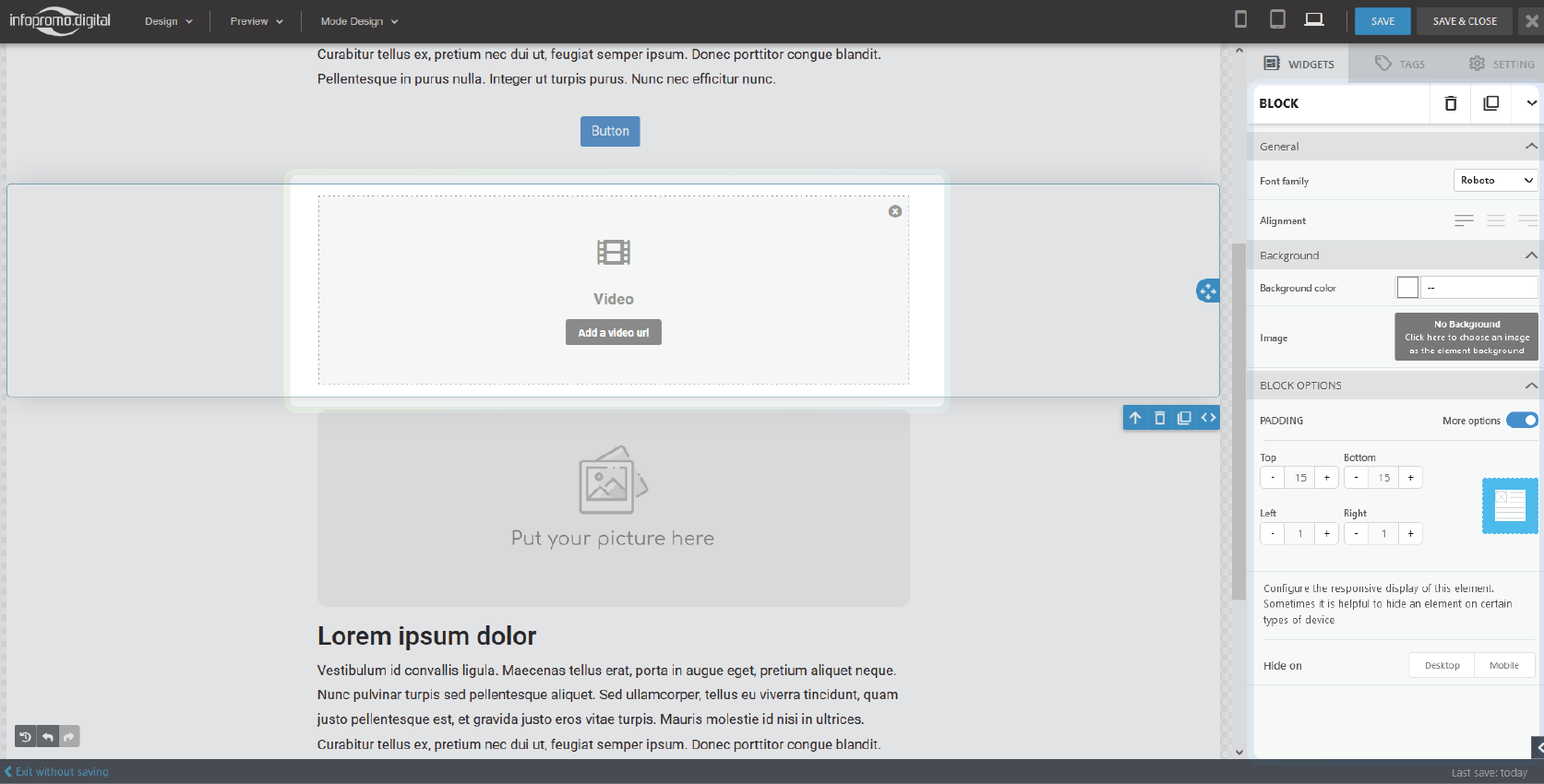
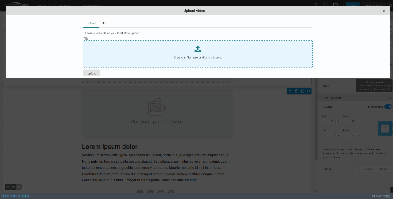
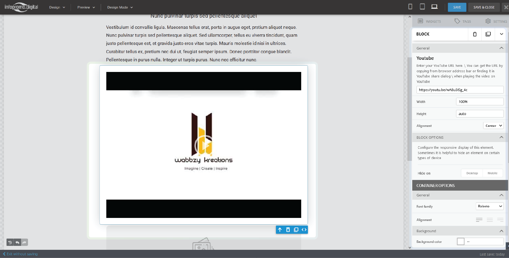
Alternatively, you can drag and drop a Youtube widget, click “Click here to add Youtube video” and proceed to add a video link and a video preview will appear.
– On the right you can adjust the video dimensions (width and height), set alignments and padding options, and configure responsive displays.
—
The Divider Element
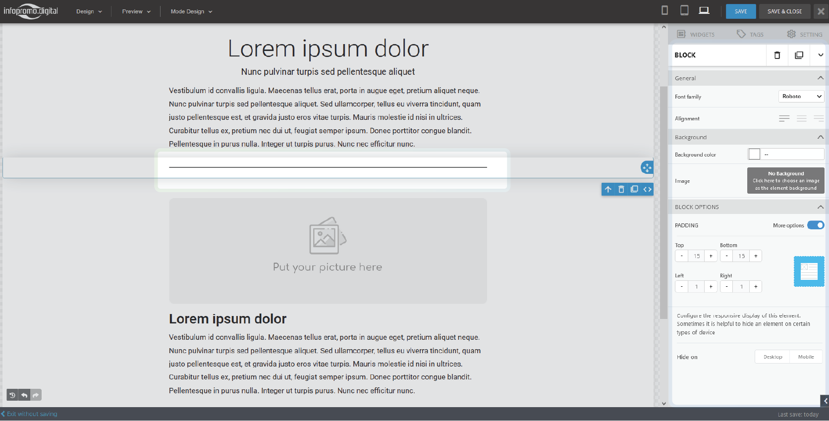
– Drag and drop the ‘divider‘ widget to your template layout and customize various block options associated with it such as background, padding, alignment, and responsive setting.
—
The Pricing Table Element
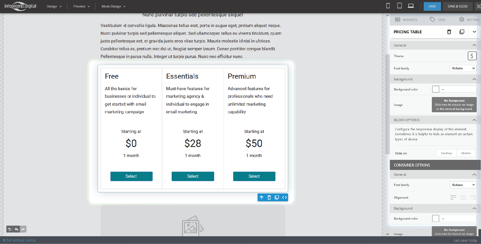
– Drag and drop the pricing table from the widget section and proceed to click on the various elements inside it such as texts, buttons, etc. On the right, you will be able to customize various element characteristics such as size, alignment, background, responsive setting, padding, etc.
—
The Table Element
– In the widget section, there are three table widget options; a 3-column, a 4-column, and a 5-column.
– Drag any table element and proceed to customize the table elements such as texts in the right pane.
—
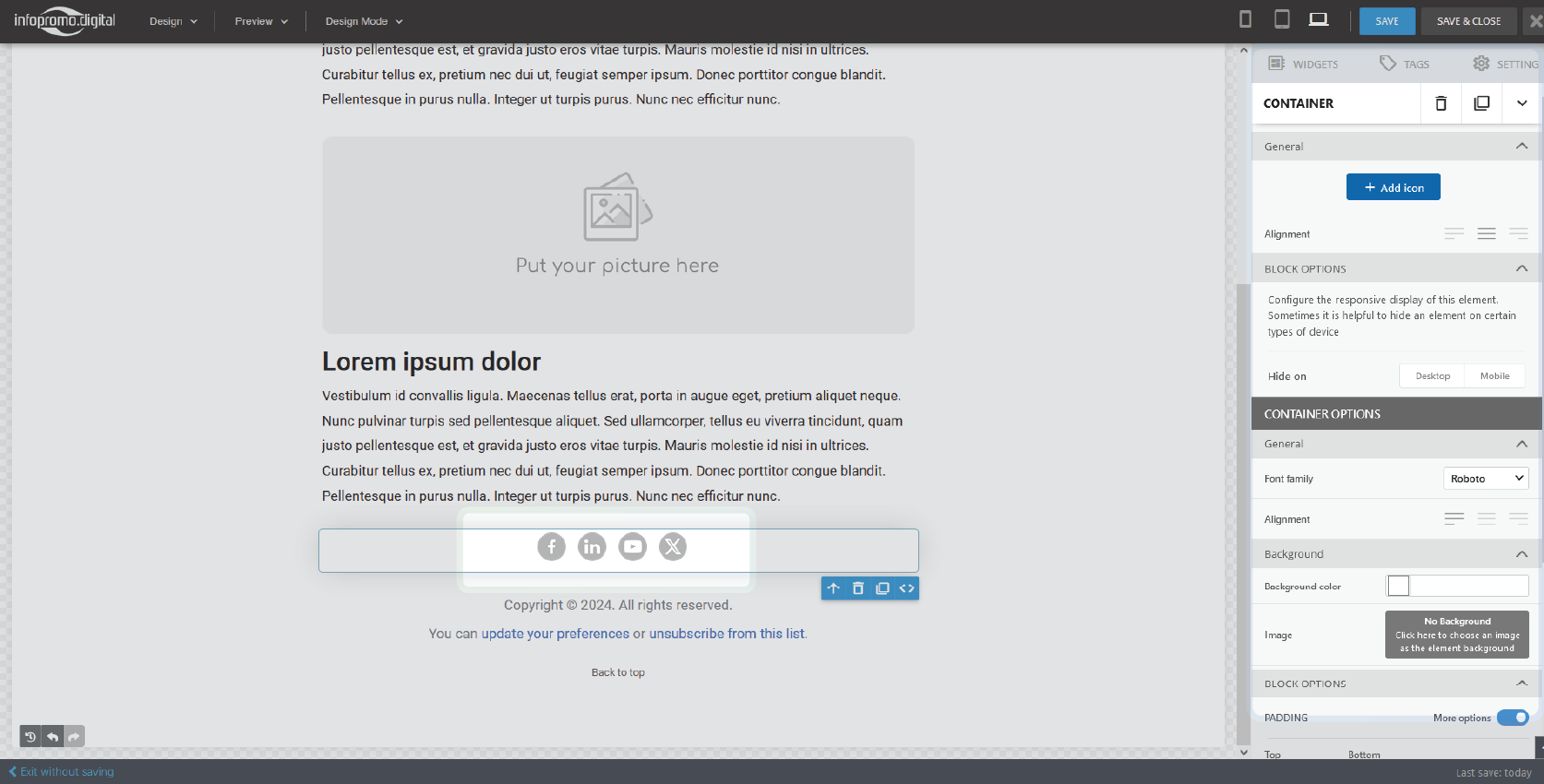
The Social Element
– Drag and drop the social links widget then start customizing it.
– You can add or remove the various social media icons by clicking on them and the delete icon or additionally, you can click on the “+ Add icon” button to add a social link.
– To customize a particular icon, select it and it will give you several options to add a link, set padding, or even change it amongst other operations.
Using Tags
Step 6: Add Dynamic Content (Optional)
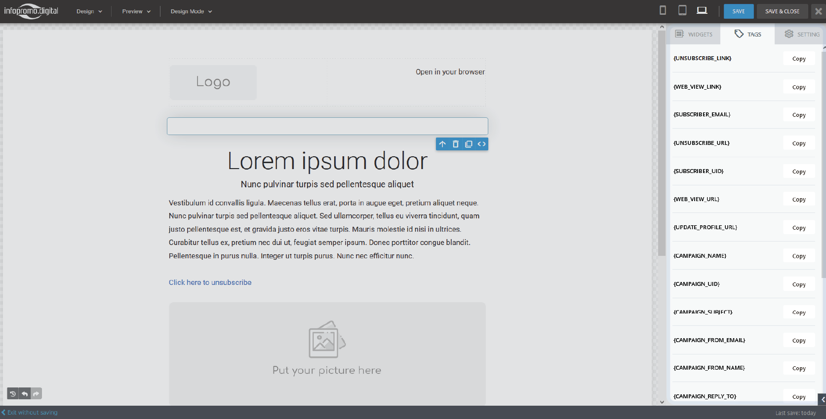
– Use dynamic content blocks to display different content to different segments of your audience. This can include links to update a profile, unsubscribe, display a subscriber’s user ID, display user email or the campaign list, etc. There are various tags you can include and to include them you navigate to the “Tags” tab on the top right and copy the specific tag in your content.
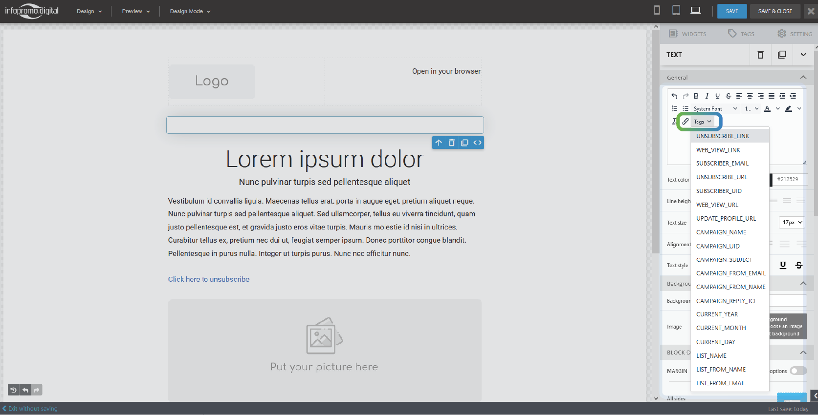
– Alternatively, you can include tags using the ‘text’ element in the text editor, at the ‘Tags‘.
Steps
– Drag any text widget
– Locate the ‘Tags‘ and click it
– Select any tag you intend to use and it will show up in the text area.
Make sure it appears in blue color for it not to show as plain text but to appear as a link.
—
Step 7: Preview the Template
– Click on the “Preview” button to see how the template will look in different email clients and devices (desktop and mobile).
– Make any necessary adjustments to ensure the template is responsive and visually appealing.
Step 8: Save the Template
– Once satisfied with the design, click “Save” or “Save Template.”
Step 9: Use the Template in Campaigns
– When creating a new email campaign, select the saved template from the “Templates” section.
– Customize the content as needed for each campaign while maintaining the overall design and structure.
Click here to learn how to create email campaigns
Step 10: Test the Template
– Before sending your campaign, send a test email to yourself and a few colleagues to check for any issues.
– Verify that all links work, images display correctly, and the email looks good on various devices.
By following these steps, you can create professional and effective email templates that streamline your campaign creation process and ensure consistent branding across all your email communications.
[ The Infopromo Library ]
Stay Ahead of the Curve With Bulk Emails
Dive into the latest trends, best practices, and industry news shaping the world of email marketing and beyond.
Getting Started With Bulk Emailing
Step-by-step guides and tutorials to help you master email marketing strategies, tools, and techniques.
Learn More
Decoding Email Deliverability
Understand email deliverability and discover actionable tips to improve inbox placement and maximize campaign effectiveness.
Learn More

Mastering Email Metrics
Dive into essential email marketing metrics such as open rates, click-through rates, and conversion rates and learn how to interpret.
Learn More


